ATS-friendly resume templates: 3 examples that work and which one to choose

An ATS-friendly resume template is a resume layout designed to keep your most important information clear, well organized, and easy to read for both recruiting technology and a person. It is not enough for it to “look simple” or for someone to call it “ATS-friendly”. Whether a resume is ATS-friendly depends on how the document is built and how the content is presented. If you want to understand what actually makes a resume ATS-friendly and what role the template plays in that, read this first: what an ATS-friendly resume really is.
In this guide (updated for 2026), you will:
- Compare 3 ATS-friendly resume templates: Harvard-style, two-column and creative.
- Understand which type of profile each one fits best.
- Choose the best template for your situation and start using it right away.
| Template | Best for | Main strength | Risk if used badly |
|---|---|---|---|
|
Harvard-style
|
Early-career candidates and linear career paths that are easy to organize | Linear order and immediate readability | It can become dense and waste space |
|
Two-column
|
Technical profiles or resumes with many skills, languages or certifications | Fits more information without losing context | It can break reading order if forced |
|
Creative
|
Profiles with projects or roles that benefit from some visual personality without losing clarity | More visual personality without giving up structure and fast reading | It is the easiest one to throw out of balance when content gets too dense |
A good template does more than make a resume look cleaner. It also helps keep important information organized, reusable, and easy to interpret in hiring processes where technology is involved. Broader context on what an ATS is and how it affects your resume.
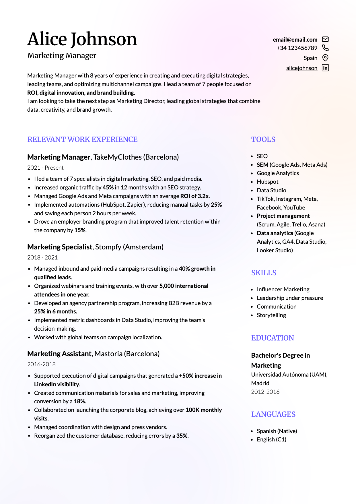
Harvard-style resume template for ATS: when to choose it and what to look for
A Harvard-style resume template is usually the safest option when you want a structure that is very clear and easy to follow. That is why it works especially well for early-career candidates and for linear career paths where there have not been major shifts in role or direction.
In the example, focus on three things: the reading order is immediate, the dates are easy to find, and the work experience can be followed from top to bottom without jumps.

Choose it if your priority is one of these:
- Presenting job title, company, dates, and achievements as directly as possible.
- You do not have much experience yet and want projects, education, and skills to read cleanly without competing with each other.
Common mistakes that ruin a Harvard-style resume template
- Building a one-column design with invisible tables or layout tricks to align fields inside the same column.
- Turning it into a dense block of text with weak hierarchy and heavy reading.
- Exporting it as an image instead of as a PDF with embedded text.
When a Harvard-style resume is not the best solution
This format can fall short when you need to fit a lot of information without making the resume too long. If you have a long work history, many tools, certifications, languages, or parallel projects, a one-column format can force you either to use more space than necessary or to squeeze the content too tightly.
In fact, it becomes counterproductive if you turn it into a dense wall of text. It may be linear, but that does not mean it can absorb long paragraphs, endless lists, or overloaded sections without losing clarity.
Myth: using a Harvard-style resume guarantees ATS compatibility
Using a Harvard-style resume does not guarantee technical ATS compatibility. This myth became popular because the format does reduce the margin for error. Since it is linear, uses recognizable blocks, and has a very direct reading path, it is often easier to extract and categorize information from it.
But a badly built Harvard-style resume can still create problems if the content is too cramped or if key fields are not clearly separated. Here’s a deeper explanation of what actually makes a resume ATS-friendly.
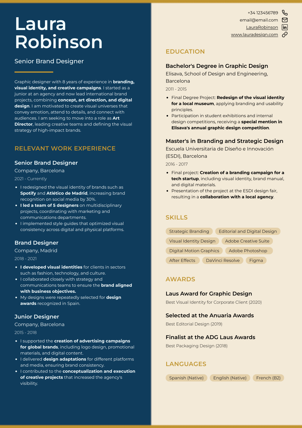
ATS-friendly two-column resume template: when to choose it and what to look for
A two-column resume template can work very well when you need to fit a lot of information without turning your resume into a long page or into a block that is hard to scan. And yes, a two-column format can absolutely still be ATS-friendly.
It usually fits especially well for technical profiles or career paths with more density: skills, tools, languages, certifications, or a change in context across roles. It can also make sense if your background already contains a lot of useful information and you want the main part of the resume to stay clean while placing supporting information on the side.
In this example you can see the most common reading pattern:
- Main column: work experience and projects with clear dates and short bullet points.
- Side column: technical skills in text, tools, languages, and certifications.
- Visual hierarchy: job title, company, and dates are easy to locate.
Look at how the reading load is distributed here. The main column holds the information that matters most when someone is evaluating fit for the new role: work experience, professional milestones, and dates. The side column contains supporting information that adds value, but should not break the reading path or force constant jumping between blocks.
That is exactly why this format can work so well. It fits more information more efficiently than a linear format like Harvard, and separates the main context from the secondary one. Used well, a two-column resume lets you show more useful signals without making the page harder to read.
Common mistakes that ruin a two-column resume
- Building the template with floating boxes, tables or decorative elements just to align content.
- Using skill bars, stars or icons instead of writing skills as text.
- Reducing the font size too much just to make everything fit.
When a two-column resume is not the best option
This format makes sense when the side column truly plays a supporting role. If you use it for skills, tools, languages, or certifications that complement the main work experience, it can help a lot. But if you try to place too many equally important pieces of information on both sides at once, it stops helping and starts competing with itself.
Myth: two-column resume templates are not ATS-friendly
This is simply false. Too many people have reduced ATS compatibility to a fake universal rule without understanding how recruiting technology actually works. Because there are badly built two-column templates that break reading order, the myth became “two columns are the problem,” when in reality the real problem is usually the construction of the document.
An ATS does not “punish” a resume for having two columns. What matters is whether it can extract and categorize the text with enough order and precision. When the hierarchy is clear and the side column works as support, the format can still work perfectly well. But if the template mixes blocks, forces odd alignments, or spreads critical information across the page without a stable reading path, extraction and reading are much more likely to suffer.
Creative resume template that can still work with ATS: when to choose it and what to look for
A creative resume template can still be a good option if the design supports the content instead of competing with it. You do not need to remove all visual personality to have an ATS-friendly resume, but the structure still has to remain clear, the sections still need to be recognizable, and the important information still needs to exist as easy-to-read text.
This type of template usually fits better for profiles where design is part of the professional context, for portfolios or project-based work, or for roles where a visual layer adds value without reducing clarity. It can also make sense if you want something less flat than the most conservative formats, but without falling into decoration that makes the resume harder to read or adapt.
This kind of model adds personality and design while still respecting what an ATS and a recruiter need in order to understand you quickly:
In this example, look at three things: the sections are still clear, the important content has not been replaced by graphics, and the design supports the hierarchy instead of distracting from it.
It can work precisely because it adds visual presence without giving up structure. If you need to show projects, reinforce a professional identity, or move beyond the plainest layout without losing readability, this can be a good base.
When not to use a creative resume template
A creative resume is not a good idea when the design adds more work than value to explaining your fit. If someone has to “read the design” before they can understand what you do, what you work with, and what you have achieved, the format is already reducing clarity.
It also becomes the wrong choice when you use it as an aesthetic showcase instead of as a communication tool. If the value of the resume depends on icons, bars, decorative elements, or visual tricks, it will usually lose clarity when you edit it, export it, or tailor it to a specific job posting.
In general, I would not use it if your priority is:
- Maximum reading speed.
- Applying to conservative sectors.
- Using a structure you can adapt many times without thinking too much about design.
Myth: a creative resume template helps you stand out on its own
This myth became popular because people confuse “catching attention” with “making evaluation easier.” A creative template may look more memorable at first glance, and that leads many people to assume it automatically differentiates them or communicates value better.
But a visual template only helps if the content is already well resolved and the design helps someone find it faster. If the job title, work experience, tools, or achievements are weakly written or hard to locate, the format does not compensate for that lack of precision.
Recruiters and systems do not value “style” as an independent sign of fit. What they need is readable information and enough context to understand what you have done and why you may match the role. If the design makes the presentation look better but does not improve clarity, it is not helping you communicate better. It is only packaging the same information more attractively.
This image summarizes myths commonly associated with more creative templates:

Where to download an ATS-friendly resume template and start using it
If you do not want to design a template from scratch, the most efficient option is to start from one that is already built to preserve structure, readability, and an easy editing base. At this point, you have already seen which type of profile fits better with a Harvard-style, two-column, or creative template, so there is no need to start with a blank page or improvise the layout.
In CandyCV, you can choose one of these three templates, customize it with your own content, and download your resume as a PDF. That lets you leave this page with an ATS-friendly resume and focus on the next step: how you explain your experience, what signals of fit you make clear, and how you tailor your content to a job posting. If you want to improve the content of your resume, follow this guide: how to write an effective ATS-friendly resume.
If none of these resume templates fits you, here is the next step
If none of these three templates fits you well enough, the first step is to identify what kind of problem you actually havebefore deciding what to do next.
If the problem is format fit, do not force your resume into a structure that does not help you explain your profile properly. Harvard may feel too linear, two columns may not solve your case, or a creative template may simply make no sense for your background. In that situation, the most useful move is to start from a different base that fits your content better, not just your visual taste. In CandyCV, you have more modern and professional templates to choose from, including ATS-friendly ones.
If the problem is not the format, but uncertainty about your current resume, do not change it on instinct. If you already have a resume and like your current template, but are not sure whether it is ATS-friendly, check that first. In this guide, you have a method with five checks to see whether the resume format you are using is ATS-friendly, or whether changing templates would make more sense.
FAQs about ATS-friendly resume templates
Which ATS-friendly resume template is safest?
The template that causes the fewest problems is not the “simplest” one. It is the one that best fits your content and lets you keep it clear. If you want the option with the smallest margin for error, a Harvard-style resume is usually the most stable. But that does not mean it is the best choice for everyone. If you have a lot of technical information, languages, certifications, or projects, a well-built two-column resume may help more. And if you need some visual personality without losing clarity, a creative one can still make sense.
How can I tell if a resume template is ATS-friendly?
There is a minimum check worth doing before you commit to a template: make sure the PDF keeps selectable text, make sure the sections still make sense when you copy and paste the content into plain text, and make sure skills, dates, and work experience still read as normal text rather than decorative elements.
That does not replace a full review, but it does stop you from choosing a template just because it looks good. If you want a more serious testing method with five checks, follow this guide on how to test if a resume is ATS-friendly.
Can I use a Word or Canva resume template if I adapt it properly for ATS?
Yes, sometimes it can work out fine. The problem is not the name of the tool, but how the final template ends up being built. Many Word and Canva templates rely on alignment tricks, decoration, or visual resources that seem convenient at first but become fragile when you edit, export, or try to tailor the resume to a job posting. Word usually gives you more control over the text, but it can also become fragile if you use templates with tables, text boxes, rigid columns, or designs that are hard to update. Here we explain when making a resume in Word makes sense and when to use another tool.
Make sure you understand what actually makes a resume ATS-friendly. And keep in mind that general-purpose tools usually cannot outperform tools that are specifically designed and optimized for building resumes, such as CandyCV.
Can a creative resume template still work with ATS?
Yes, it can. What matters is not whether the format has more visual personality, but whether it still keeps clear sections, real text, good hierarchy, and an easy reading path. A well-built creative template can work if the design supports the content instead of replacing it.
What usually ruins it is not the fact that it is creative. It is when the design takes up too much space, complicates editing, or turns important information into graphics, icons, or decoration. If the content is still easy to understand quickly and the template fits your profile, a creative resume can still be a good base.
Can a two-column resume still be ATS-friendly?
Yes. The myth that only a Harvard-style resume is ATS-friendly is false. The problem is not the columns. It is the structure. A two-column resume usually works when the information hierarchy is clear, there is enough spacing between sections and elements, and the final file is exported as a PDF with embedded text.
What usually breaks it is building the document with boxes, tables, and floating elements that interfere with or alter text extraction and categorization.
Does Harvard format guarantee ATS compatibility?
No. Harvard reduces the margin for error because it is linear, but it does not “guarantee” anything if it is badly built. A Harvard-style resume can still be less ATS-friendly if it uses layout tricks to align dates, if parts of the document are turned into images, or if hierarchy and readability are sacrificed by cramming the text too tightly.