Professional resume templates: 5 free modern designs and how to choose yours

If you’re looking for free modern resume templates, there are two easy ways to get it wrong:
- You pick a “pretty” template that takes effort to understand.
- You pick a “safe” template that looks like an admin document from 2009.
This isn’t an endless gallery. It’s five resume templates you can customize and download, plus the only part that actually helps: how to pick the one that fits your role, industry, and style.
In this guide, you’ll:
- Choose from 5 modern, professional resume templates (based on what they signal and how they read).
- Download a free PDF and customize it without the design falling apart.
- Understand what makes a resume look “modern” and “professional” in real terms: hierarchy, readability, typography, and color.
Pick a professional resume template fast (5 modern options compared)
Here’s the quick comparison. If you want the full breakdown, keep reading.
Pick the best resume template and start building it now.
| Style | Resume Template | Best for |
|---|---|---|
| Modern | 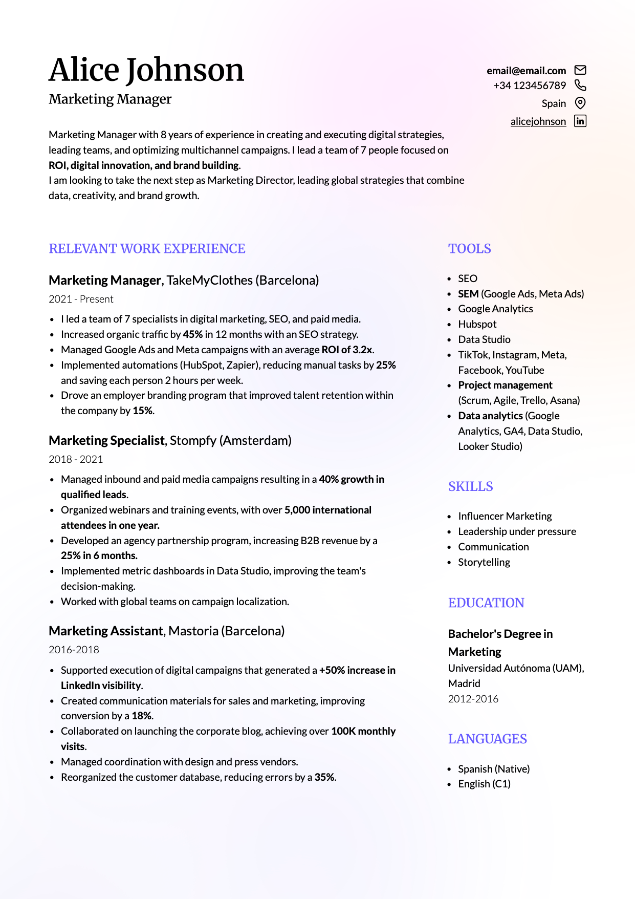 |
Modern industries (tech, product, ops), generalist profiles, experienced professionals who need strong hierarchy |
| Creative | 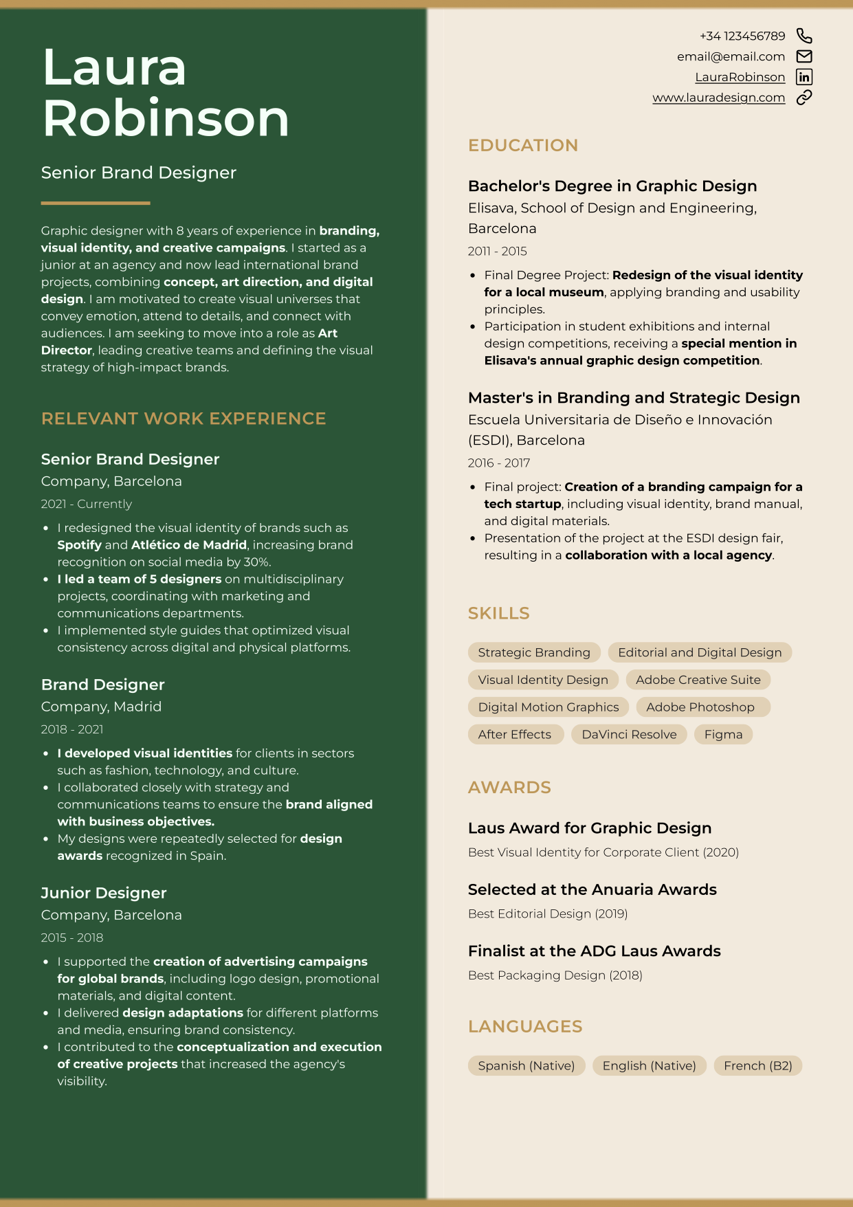 |
Creative roles (marketing, design, communications, architecture) where personality is an asset |
| Minimalist | 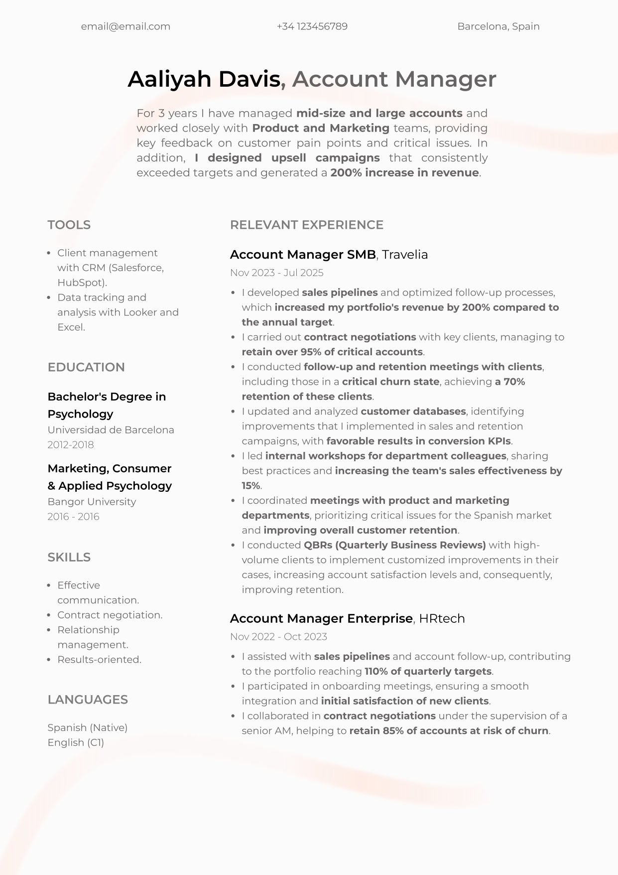 |
“Quietly senior” roles: leadership, operations, admin, healthcare, education, technical roles that benefit from calm authority |
| Harvard-style |  |
Conservative contexts, early-career clarity, or anyone who wants a familiar linear structure with a more human tone |
| Professional (photo-led) | 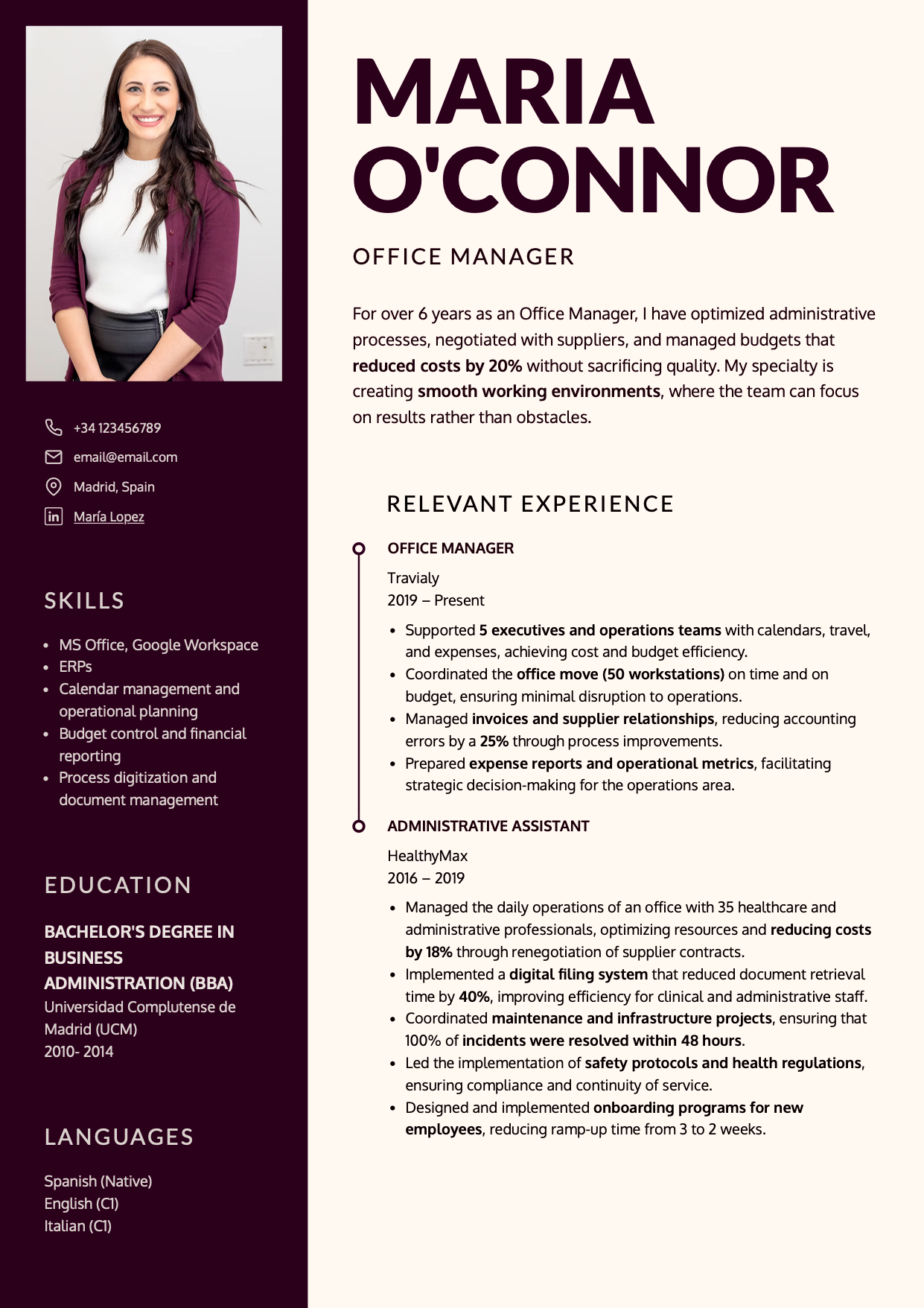 |
Public-facing roles and markets where a photo is acceptable and genuinely adds value |
If you were actually looking for something closer to a Word-style resume template, this selection of Word-style resume templates to edit online and download as PDF will probably fit better.
If you’re worried about hiring software compatibility
If you are comparing these templates with a Word template, keep in mind that the problem is not Word itself, but how the template is built. Many Word templates use tables, text boxes, or rigid structures that can make the resume harder to edit, export, or read correctly. Here we explain how to make a resume in Word without letting the template limit your application.
If you want a deep, technical version (formats, parsing checks, and template traps), check ATS-friendly resume templates and download yours free.
What makes a resume template modern and professional
Before we get into the five templates, you should know what “modern” and “professional” really mean. Modern isn’t “more color.” Professional isn’t “as bland as possible.”
A template works when it does two things at once:
- It’s easy to understand fast (because it guides the eye).
- It lets you add real content without breaking the layout.
Visual hierarchy and reading speed
Your resume layout quietly communicates how you think and prioritize. A strong template makes the essentials obvious:
- Your target role (what you do).
- Your most recent work experience (what you’ve done and where).
- Dates (so your progression is easy to place).
- Key skills and tools (relevant to your role).
- In some roles: required education, licenses, or certifications.
If someone has to “hunt” for basic information, you’ve already lost. Recruiters don’t donate attention.
Typography and tone
A well-chosen font combination signals taste and intention. It also determines whether your resume stays readable at smaller sizes (which matters more than people admit).
A classic serif (for headings) can feel credible and editorial. A clean sans serif (for body text) usually reads faster and feels more current. The key is consistency: two fonts max, used with discipline.
Color and perception
Color is both functional and psychological. It can help your resume read better, or ruin it.
Use color for one of these jobs:
- Create hierarchy (your name, section headings, impact).
- Group related information (so sections feel structured).
- Guide the eye (where to start, where to continue).
- Add personality without noise (subtle accents, not decoration).
Two practical rules beat any “color theory” speech:
- Prioritize contrast. If text loses strength, readability is gone.
- Use one background tone and one accent tone (two accents max, but most people don’t need it).
The 5 professional resume templates (free download)
These five are designed to help the resume scan fast, stay balanced when you edit, and communicate something intentional without trying too hard.
Modern resume template “Lisbon”
Lisbon is the “clean modern” option: polished, structured, and quietly confident. It’s two columns, with the left side visually heavier, which naturally emphasizes experience and achievements (especially useful when you have real mileage).
Download and customize your modern resume template here.
Who it’s for and what it signals
Choose Lisbon if:
- You want a resume that reads fast and looks intentional without being flashy.
- You need to fit a decent amount of content without turning the page into a wall of text.
- You’re in a modern environment (product, operations, tech, consulting, sales).
Avoid it if:
- You want a highly expressive creative look (Cordoba will fit better).
- You want the photo to be the core of the design (New York is built for that).
Why it works
Lisbon is built around hierarchy. On the first scan, the reader can catch:
- Who you are (role).
- What you do (recent experience).
- Where the key blocks live (skills, education, projects if relevant).
It reduces the “cost” of finding information. That alone is professional.
How to customize it without breaking the layout
- Default font pairing in the existing page: Merriweather (headings) + Lato (body). Keep the principle even if you swap fonts: one for tone, one for speed.
- Change background and accent colors only if contrast stays strong.
- If you need space, do this before shrinking font size:
- Cut repetition and filler.
- Convert paragraphs into tight bullet points.
- Adjust spacing.
Creative resume template “Cordoba”
Cordoba is creative, but not chaotic. It splits the page evenly into two columns, which instantly feels less traditional; useful when your role rewards taste, design sensitivity, or strong personal branding.
Download and customize your creative resume template here.
Who it’s for (and when to avoid it)
Choose Cordoba if:
- You work in marketing, design, communications, digital product, architecture, education, fashion, or similar environments where aesthetics communicate judgment.
- You want to stand out without resorting to icons, skill bars, and decorative clutter.
Avoid it if:
- You’re applying into highly conservative industries and you know “visual risk” gets penalized early.
- Your content is long and you’ll end up with awkwardly unbalanced columns.
Why it works
Cordoba is “creative with structure.” The layout is symmetrical, but the details (spacing, transitions, color atmosphere) give it personality without stealing attention from content.
How to customize it without turning it into a poster
- This template needs concise text. If you’re writing dense blocks, Lisbon or Oslo will support you better.
- Pick two complementary tones with strong contrast. If one side is dark, the other should breathe.
Minimalist resume template “Oslo”
Oslo is minimalist in the best way: calm, clean, and confident. It’s designed for people who want to look precise and mature without looking rigid.
Download and customize your minimalist resume template here.
Who it’s for and why it feels “senior”
Choose Oslo if:
- You have experience and want the resume to feel composed and reliable.
- You’re in roles where clarity and trust beat “creativity” (operations, admin, healthcare, education, technical roles, management).
- You want a template that won’t age quickly.
Why it scans so easily
Oslo uses two columns with different visual weight:
- The wider right column carries your story (experience/impact, or education/projects early-career).
- The narrower left column acts like a guide rail (contact, skills, tools, languages).
That structure is naturally scannable and reduces friction.
How to customize it without shrinking the font into dust
The fastest way to ruin Oslo is to cram content by shrinking font size until it’s barely readable. If you genuinely have volume, two pages beats micro-text.
Classic one-column resume template “Toledo”
Toledo is a Harvard-style layout with a more human feel. It keeps what makes the Harvard format strong (one column, familiar structure, predictable scanning) but adds a small tactile detail that makes it feel less cold.
Download and customize your one-column resume template here.
This layout is especially useful when:
- You’re early-career and need the structure to do some of the communication work for you.
- You’re applying to conservative or compliance-heavy environments where flashy design gets punished early.
- You’re switching roles and you want your story to feel coherent at a glance.
What makes Toledo work is not the aesthetics. It’s the reading order. The recruiter can follow it without effort: role → experience → education → skills. That’s what “professional” looks like in practice.
Professional resume template “New York”
Unlike previous templates, which use a base color plus several accent tones (for headings or design elements), New York is duotone, meaning color contrast becomes a key design decision.
Download and customize your professional resume template here.
When a photo helps (and when it’s a bad idea)
In some countries (including the US, Canada, and the UK), including a photo is generally discouraged due to hiring norms and anti-discrimination practices. In many European and LATAM markets, it can still be common. Adapt to the market you’re applying in.
Why duotone design can look powerful or disastrous
New York is duotone: two tones only, no gradients in between. That means contrast is everything. If contrast is weak, the design collapses.
Black and white always works. If you want something more memorable, keep it restrained: dark + light neutral, or warm + cream.
How to customize it and keep legibility
If you use a photo, it must be professional: clean background, good lighting, and just you. Otherwise the design amplifies the wrong signal.
If you remove the photo, you also remove the point of this template, so pick another layout instead of forcing it.
Conclusion: your resume should make sense before it gets read
A strong resume doesn’t start when someone reads it. It starts when someone looks at it and decides whether it deserves attention.
That’s why design isn’t decoration. It’s hierarchy, structure, and reading speed.
Go to CandyCV, one of the best resume builders, and pick the template that matches your industry’s risk tolerance and your content volume. Then make it do its job: help the right information get seen fast.
If your decision is less about choosing a template and more about choosing the tool you will build it in, read this guide to resume tools and what each type actually solves.
FAQs about modern and professional resume templates
Where can I download free modern resume templates?
You can choose a template in CandyCV, add your content, and download a clean PDF. The real value isn’t “downloading a file,” it’s being able to customize structure, spacing, typography, and color without the design collapsing.
What’s the difference between a modern resume and a professional resume?
“Modern” is the visual language (current fonts, spacing, composition). “Professional” is the effect: it reads fast, stays clear, and feels intentional. A resume can look modern and still be unprofessional if it’s confusing.
Which resume template should I use for a creative role?
If your field rewards taste and visual communication (design, marketing, communications, product), a more expressive template can help, as long as it stays structured and readable. If you’re early-career or changing roles, a modern but less disruptive template often performs better.
What resume template works best for conservative industries?
In conservative environments, predictable scanning wins: clean structure, restrained color, and minimal decoration. Prioritize clarity over originality.
What’s the best color for a professional resume?
There’s no universal “best.” Use color to support hierarchy and readability. Neutrals are safe. Blues/greens tend to feel calm and trustworthy; warm accents can add energy if contrast stays strong.
Can I customize these templates without breaking the layout?
Yes. A good template should survive real edits: changing section order, adjusting spacing, updating fonts, and refining density without turning into a mess.