Download 5 free modern and ATS-friendly resume templates (design analysis)

Finding the perfect resume template isn’t just about picking a pretty layout. A well-designed resume creates a strong first impression before a single word is read. It guides the recruiter’s eye and tells a story about who you are.
That’s why every professional template is more than aesthetics: it’s psychology, composition, and visual balance.
In this guide, you’ll find:
- An in-depth look at five resume templates, each with a distinct visual, chromatic, and emotional approach:
- Modern Resume Template
- Creative Resume Template
- Minimalist Resume Template
- Harvard Resume Template
- Professional Resume Template
- What makes a modern, professional resume template truly effective.
- How visual hierarchy and reading patterns shape how recruiters process your information.
- The role of color psychology in your resume design.
- Why ATS compatibility (Applicant Tracking Systems) is essential and how to achieve it without sacrificing great design.
And most importantly, you can customize and download your free resume template right here.
At CandyCV, we apply design principles to build templates that reflect your mindset, professional value and personal style. Our goal is to help you communicate who you are and what you bring to the table, because standing out takes more than good content.
What makes a modern and professional resume template
Before we dive into the examples, it’s important to understand what your resume design says about you. Every choice (layout, color, font, and spacing) influences how a recruiter perceives your profile before even reading it.
Here’s what defines a truly modern, professional resume:
Visual hierarchy, layout and reading patterns
Believe it or not, your resume’s layout reveals how you think and prioritize. A well-structured template leads the eye naturally and makes reading effortless:
- A single-column layout communicates focus, that’s why it’s ideal for linear career paths.
- Two columns with a wider left side emphasize experience and achievements, which is great for established professionals.
- Two balanced columns (50% of the page) suggest lateral thinking and are often used by creative or multidisciplinary profiles.
- Two columns with a wider right side align with the natural “F-shaped” reading pattern, making the document easier to scan.
When the visual hierarchy is well executed, the reader finds key information without effort.
The psychology of color in resume design
Color is both a psychological and functional tool. Each shade evokes different emotions and can subtly influence how your professional profile is perceived.
Color should serve one or more of these purposes:
- Create hierarchy: making important elements stand out first (your name, section titles, achievements).
- Group related sections: improving visual order and coherence.
- Guide the eye: helping the reader intuitively know where to start and continue.
- Express personality: subtle color accents can say a lot about you without distracting from readability.
Recent studies in affective design show that people react more positively to documents with carefully applied color accents than to fully grayscale or black & white layouts.
In a resume, colors operate on two levels:
- Background color sets the overall tone, the subconscious first impression.
- Accent colors define hierarchy, direct attention, and enhance readability. Stick to one or two at most.
The right balance between both defines the emotional personality of your document. Generally speaking, color psychology suggests that:
- Blue and green tones convey trust, calmness, and emotional maturity; suitable for both background and accent.
- Soft pinks, purples, and beiges communicate warmth, approachability, and sophistication; also versatile for backgrounds or accents.
- Oranges and corals suggest energy and positive leadership. Best used as accent colors but great for bold designs.
- Yellows have poor contrast and should be used sparingly, only as accent colors.
- Whites, grays, and neutrals work best as background colors, not accents.
ATS-friendly resume design
Applicant Tracking Systems (ATS) scan your resume to extract and classify data such as job titles, dates, and skills. Contrary to popular belief, ATS can read templates with two columns as long as the file is properly structured.
Or check out our in-depth article on how a resume template should be optimized to get interviews.
The communicative role of typography
A well-chosen typeface shows taste and intention. Without a single word, it gives your resume tone and character, and determines whether it’s legible at smaller sizes (a crucial factor for digital screening).
A classic serif (like Georgia or Merriweather) conveys depth and professionalism, while a clean sans serif (like Lato, Inter, or Oxygen) projects clarity and digital fluency. Combining them consistently builds authority and accessibility.
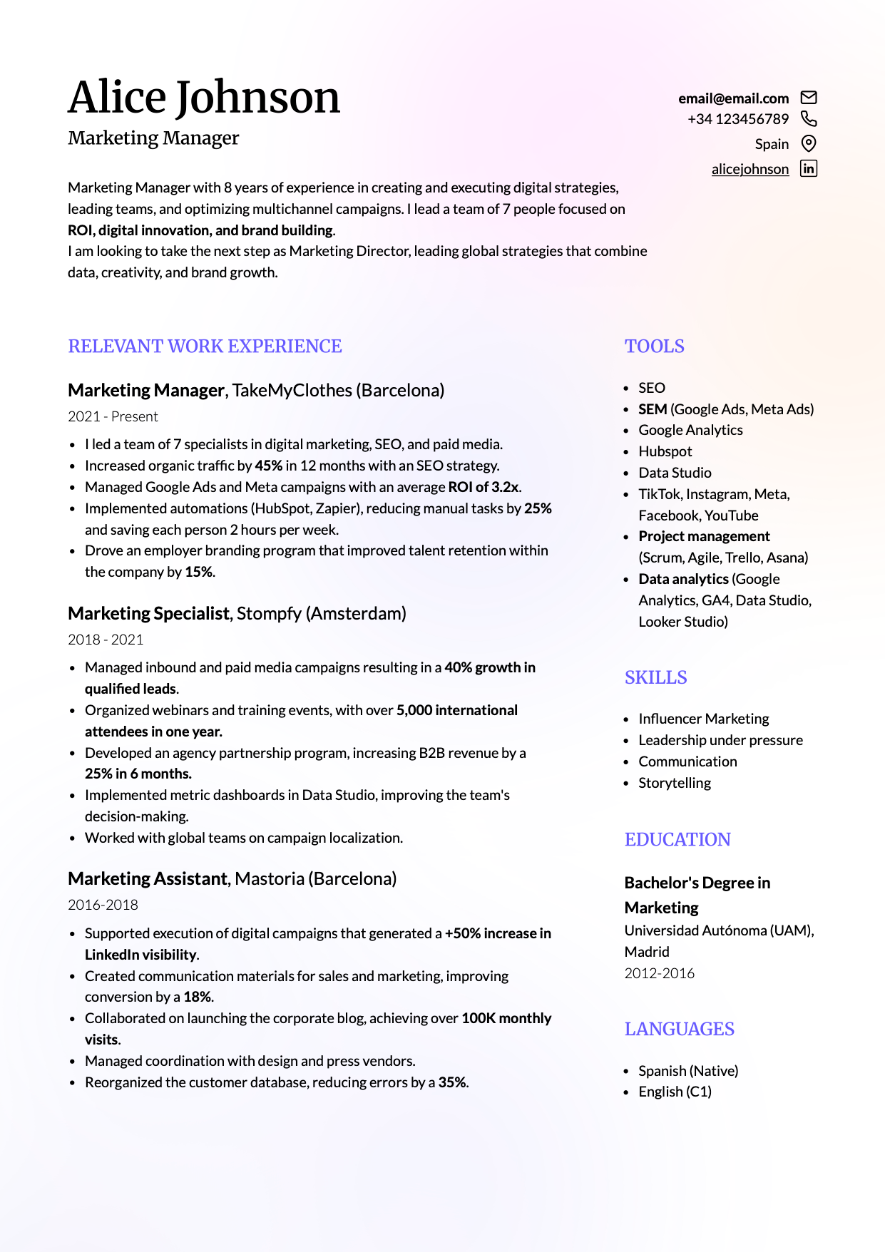
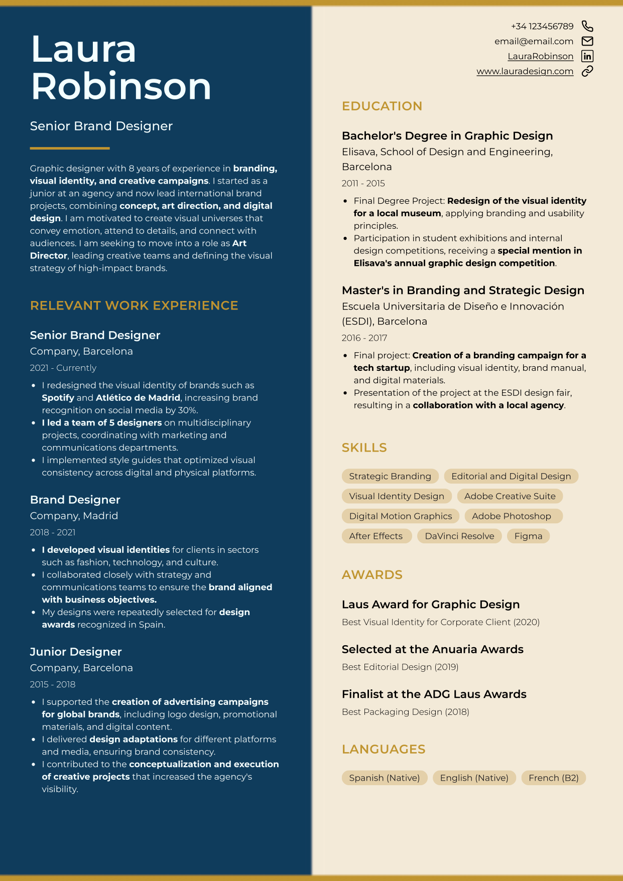
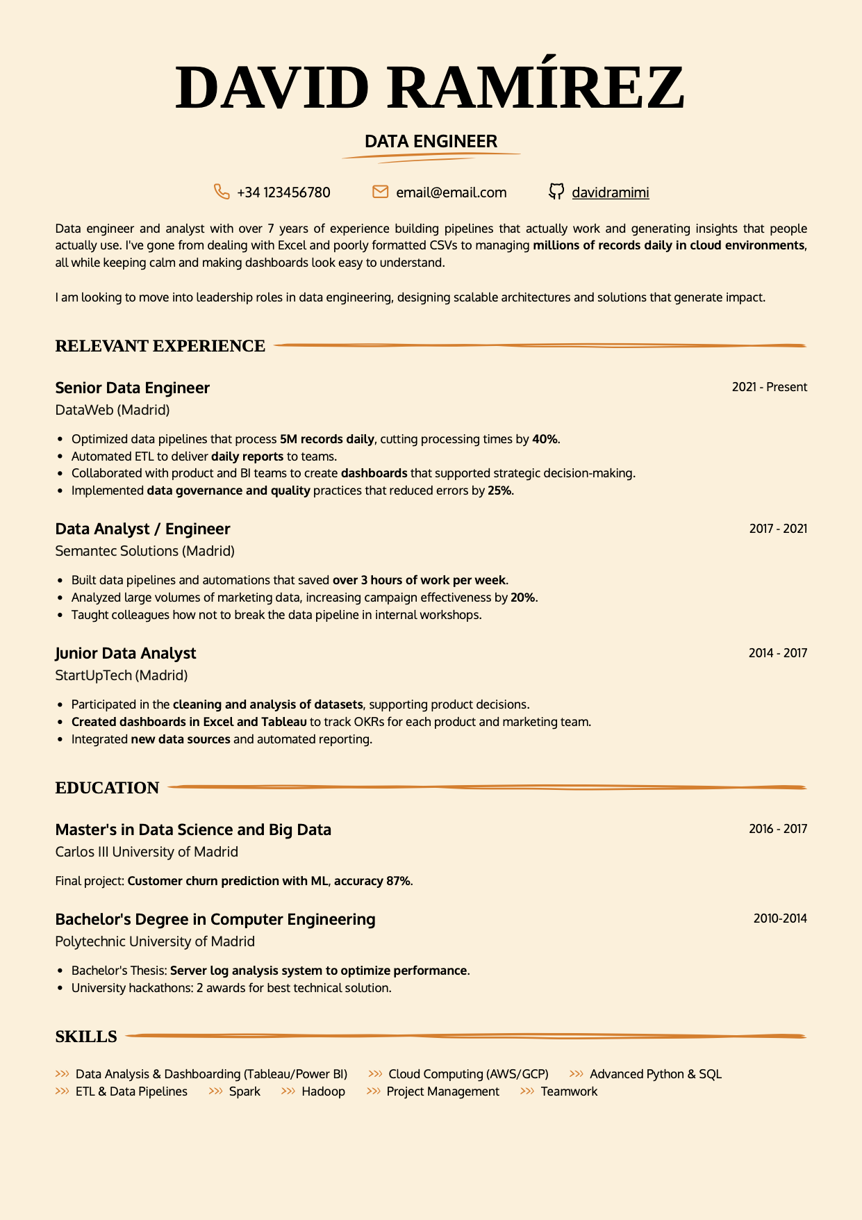
Modern resume template “Lisbon”
The modern resume template Lisbon strikes the perfect balance between aesthetics and functionality. Its design radiates clarity, intention and taste, bringing the warmth of a layout crafted to communicate with precision and elegance.
 |
 |
Resume layout and visual structure: how “Lisbon” communicates modernity
Every section of Lisbon is clearly defined, with generous margins that project mental clarity and control over content.
Its two-column layout guides the reader’s eye naturally, making the resume easy to scan. The harmony between information density and white space conveys confidence and professional maturity. It doesn’t try to impress: it invites reading. Prioritizing readability is, in itself, a mark of good judgment.
Best fonts for a modern resume
The combination of Merriweather (for headings) and Lato (for body text) creates a professional yet approachable tone. Merriweather evokes credibility and refined taste, while Lato adds fluidity and a modern edge.
Someone who uses this type pairing on their resume comes across as thoughtful, detail-oriented and design-savvy; a modern professional with visual sensitivity.
Modern resume color palette
One of Lisbon’s most distinctive features is its use of color: a subtly tinted background (warm or cool, depending on your version) with soft chromatic clouds in the corners. This creates a subtle emotional atmosphere and adds depth.
In a sea of flat, monochrome resumes, those faint, almost imperceptible gradients make your document feel dynamic and memorable.
What this modern resume design says to recruiters
When a recruiter opens this template, they immediately perceive:
- Clear structure and organized thinking.
- Maturity and professionalism.
- Empathy in communication as the document reads effortlessly.
- Authenticity and dynamism.
Download the modern resume template “Lisbon”
Download the Lisbon modern resume template and edit it easily in CandyCV.
You can add or remove your photo, adjust colors, rearrange sections, or customize titles based on your experience. You can also tweak fonts, sizes, and spacing while keeping the visual balance that defines its style.
If you’re looking for a clean, readable resume with editorial elegance, this is it.
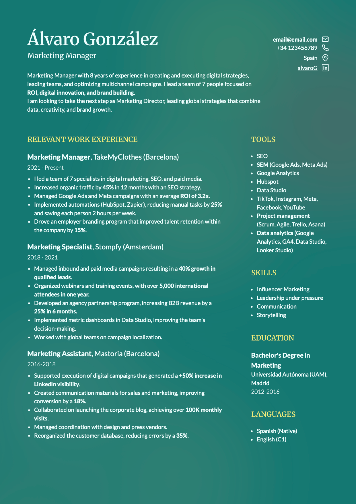
Creative resume template “Cordoba”
The creative resume template Cordoba makes you impossible to forget. Its two-column layout splits the page evenly, challenging traditional formats and expressing the creativity and emotional balance of someone who understands contrast and harmony.
 |
 |
Creative resume design
The symmetry of Cordoba feels bold yet remains professional and refined. Small details such as the spacing, color use and smooth transitions bring it to life.
This combination of structure and expressiveness makes the resume feel human and sophisticated. It’s not flashy for the sake of it; it creates a genuinely positive impression through attention to detail and its ability to communicate personality.
Resume color palette for creative professionals
The color scheme is the heart of Cordoba’s personality. Instead of rigidly divided blocks, both tones blend seamlesslywith soft transitions, creating an emotional effect of dialogue rather than contrast. It conveys maturity, empathy and mental fluidity; the kind of balance that draws attention naturally.
Modern fonts for a creative resume
The Montserrat typeface is used for both headings and body text. Its geometric, modern shape feels inherently digital and structured. Subconsciously, it communicates order and creativity in equal parts.
Montserrat is also highly legible at small sizes and fully ATS-compatible, ensuring that your resume’s visual appeal never compromises its functionality.
What recruiters see in a creative yet balanced resume
When recruiters open this template, they instantly perceive:
- Creativity and confidence in communication.
- A clear sense of structure, innovation without chaos.
- Excellent readability that makes scanning effortless (remember, you only have a few seconds to catch their attention).
- Aesthetic sensitivity and strong attention to detail.
⚠️ We don’t recommend it for highly conservative industries (finance, banking, public administration). In those cases, a more understated template works better.
Download the creative resume template “Cordoba”
Download the Cordoba creative resume template and personalize it easily in CandyCV. Choose the colors and fonts that best represent you, add or remove your photo, and reorder sections to highlight what matters most in your career.
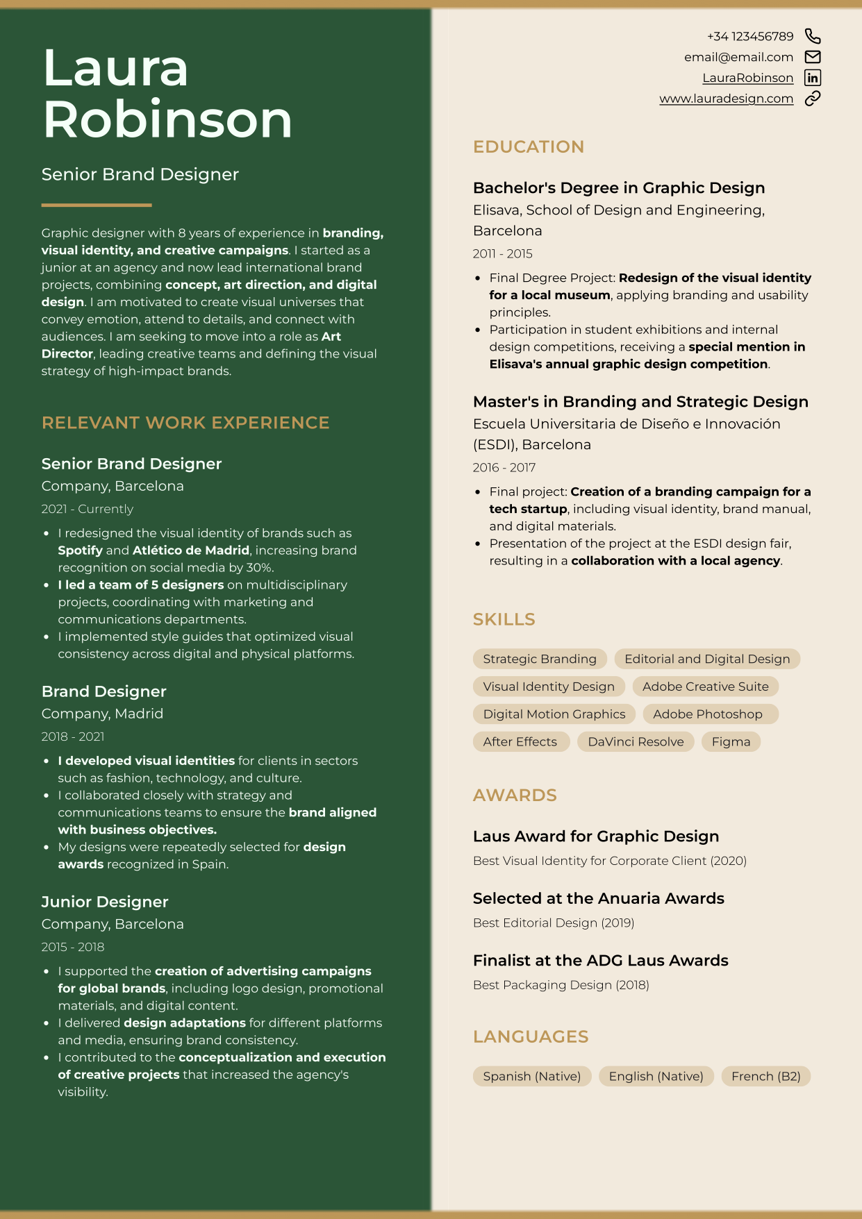
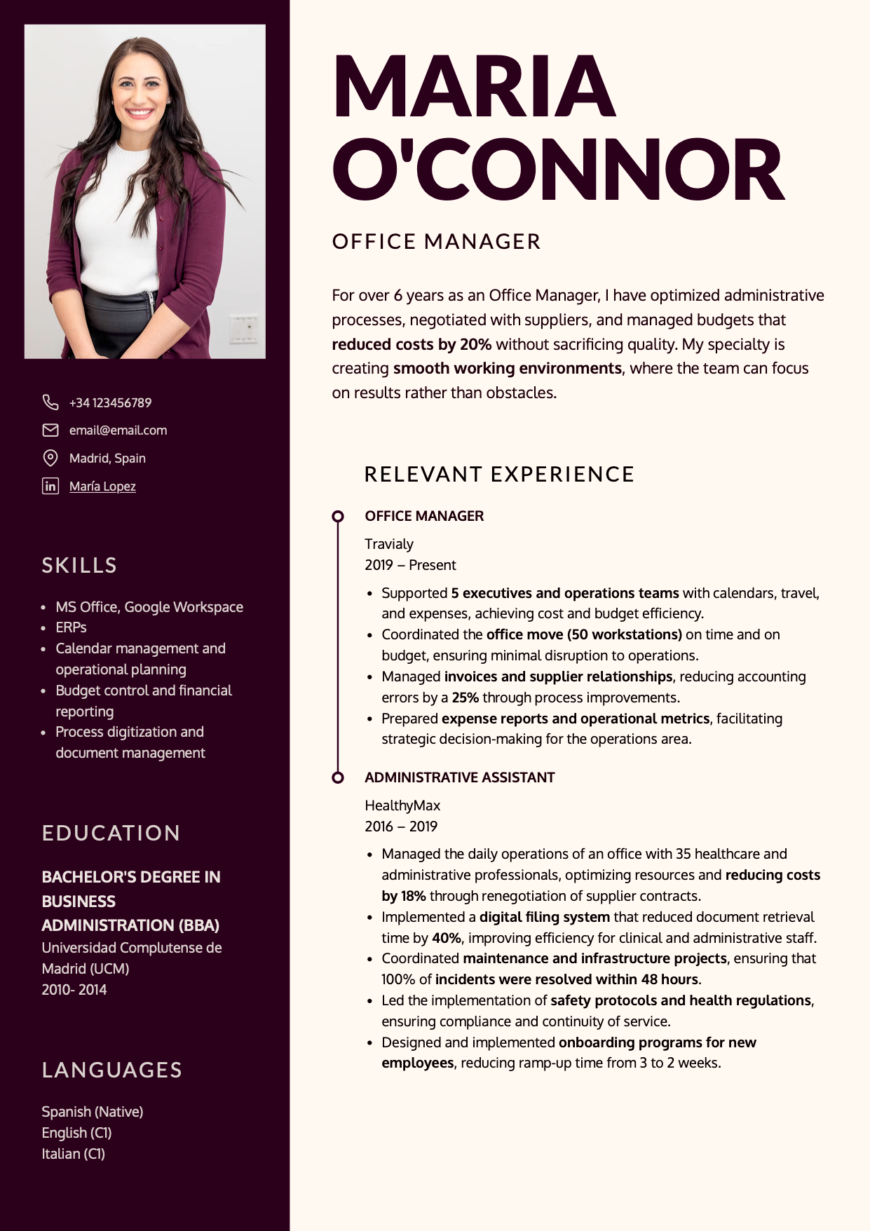
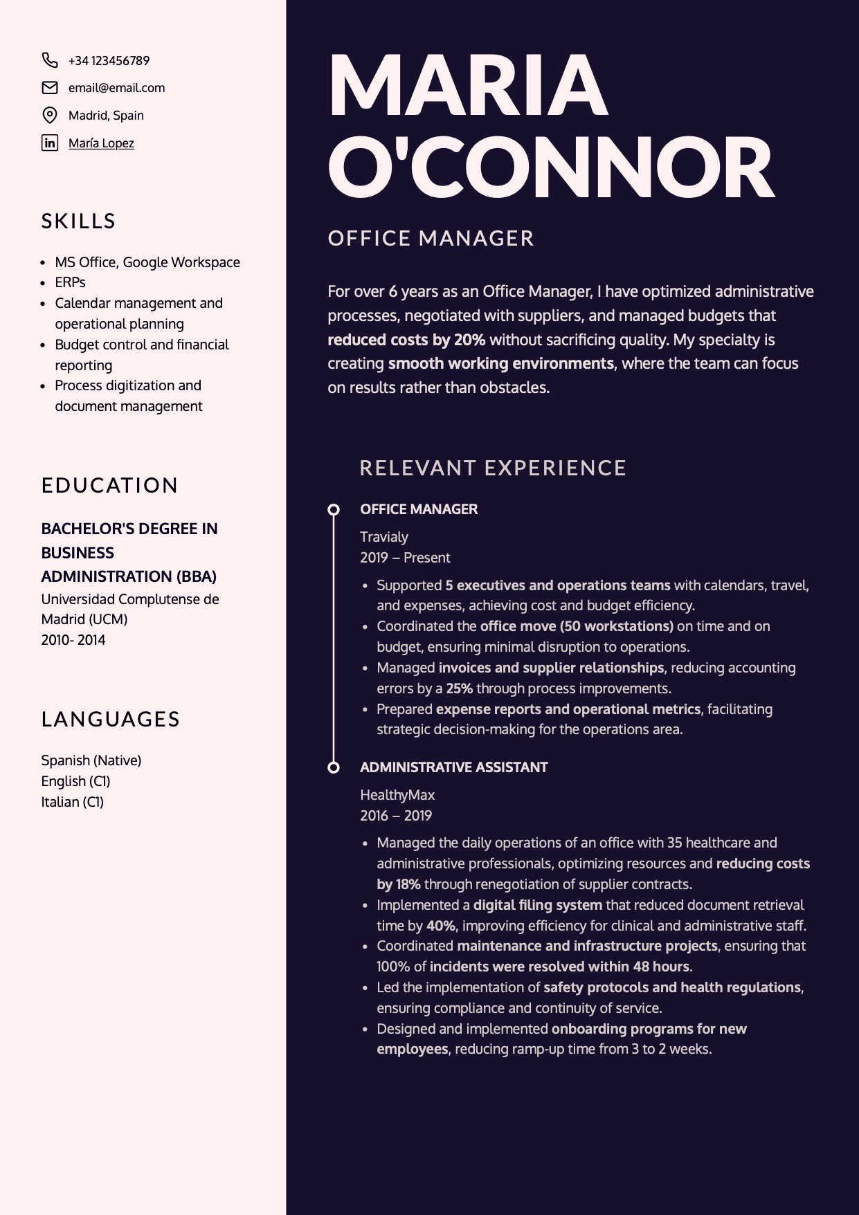
Minimalist resume template “Oslo”
The Oslo resume template embodies naturalness and composure. It’s designed for professionals who want a resume that feels elegant, confident and effortlessly polished.
 |
 |
Minimalist resume layout: two-column design with natural reading flow
The Oslo professional resume template uses two columns with distinct visual weight:
- The wider right column holds your main story: experience and achievements for seasoned professionals, or education and projects for those early in their careers or transitioning fields.
- The narrower left column acts as a guide rail, giving breathing room and context (contact details, skills, languages, tools).
This layout follows the natural F-shaped reading pattern, leading the eye from the top left through the main content seamlessly.
The result is a resume that flows effortlessly: clean, structured, and easy for the brain to process. That sense of order projects professionalism and analytical thinking.
Minimalist resume color palette
The shades of blue and violet in the examples above define Oslo’s emotional tone. They create an open, welcoming atmosphere, while darker accents ground the design with a sense of authority. This contrast reflects a duality that feels both solid and human: a logical mind with emotional intelligence.
Best font for an elegant resume
The Inter typeface gives voice to this layout: modern, clean, and adaptable. Its balanced strokes and generous letter spacing make it exceptionally readable, even at smaller sizes when you need to fit more information.
Fully ATS-friendly and highly legible, Inter creates an instant impression of confidence and clarity.
How recruiters perceive a minimalist resume
When a recruiter opens an Oslo resume, they immediately sense clarity, maturity, and composure.
It conveys the impression of someone methodical, refined, and confident in their work. Someone who knows that good communication is a form of respect.
Download the minimalist resume template “Oslo”
Download the Oslo professional resume template and customize it easily in CandyCV.
You can adjust colors, headings, sections, and fonts; or remove the photo if you prefer a more understated look. The editor lets you fine-tune spacing and hierarchy for a layout that reads naturally and precisely.
Harvard-style resume template “Toledo”
The Harvard-style resume template Toledo redefines what the classic Harvard format can be. It balances timeless structure with modern warmth, adding a tactile, emotional touch through a unique hand-drawn accent.
 |
 |
Contemporary Harvard resume design
The Harvard format remains popular for good reason: it’s clean, familiar, and recruiters instantly know where to find key information. In this article, I explain why the Harvard resume format still works so well.
However, CandyCV’s Toledo template adds a small but powerful twist: delicate, hand-drawn lines that feel light and organic.
These strokes introduce rhythm and texture, breaking the coldness of the classic layout and creating a sense of authenticity and warmth, as if the document itself had a personality.
Harvard resume color palette: calm or energizing, depending on your story
You can customize this template to suit your tone and audience. We designed two sample versions, each with a distinct emotional impact:
- Green on white lines: conveys competence and professionalism, ideal for technical, scientific, administrative, or skilled-trade profiles.
- Soft tangerine: brings energy, optimism and approachability. With its light orange background and vivid lines, it’s perfect for professionals who work with people or in dynamic environments such as education, healthcare, customer service, or entrepreneurship.
In both cases, color acts as an emotional climate, not decoration. It enhances readability and reinforces the sense of a resume that feels alive, balanced, and human.
Font pairings for a Harvard-style resume
The pairing of Georgia (for headings) and Oxygen (for body text) completes Toledo’s balance of tradition and freshness. Georgia brings editorial authority and timelessness, while Oxygen adds lightness and modernity.
The result is a resume that feels mature and highly readable. Both fonts are fully ATS-compatible, ensuring flawless parsing across any applicant tracking system.
How recruiters perceive this human-centered Harvard resume
When a recruiter opens the Toledo template, they instantly sense something different. The hand-drawn strokes and clean structure convey warmth, professionalism and meticulous attention to detail.
Download the modern Harvard resume template
Download the Toledo template and customize it easily in CandyCV.
Choose between the white-and-green version, the soft tangerine tone, or any other palette that represents you best. Add a photo if you wish, reorder sections, or reduce font size and margins to include more content without losing clarity or accessibility.
Professional resume template “New York”
The New York template brings the professional resume format into a more expressive territory: one that blends strong visual contrast with a clear focus on the person behind the content, thanks to its prominent photo area.
Unlike previous templates, which use a base color plus several accent tones (for headings or design elements), New Yorkis duotone, meaning color contrast becomes a key design decision.
 |
 |
⚠️ Note: In some countries such as the United States, Canada, and the United Kingdom, it’s generally discouraged to include a photo on your resume. Anti-discrimination laws and hiring practices in these regions favor text-only resumes to ensure objective evaluation.
However, in most European countries (such as Spain, France, Germany, and Italy) and in many parts of Latin America, including a professional photo is still common and socially encouraged, especially for client-facing or communication-related roles.
Always adapt your resume to the local norms and expectations of the market where you’re applying.
Professional resume layout
This design divides the document into two columns, distinguished by a large, integrated photo section. The image isn’t decorative but acts as an anchor within the narrow column, making the person the central focus of the layout.
This choice conveys authority and presence, a strong message for professionals who work with people or lead teams.
That said, it’s important to be mindful of bias risks. A resume with a photo can be powerful, but only if the image is professional: good lighting, neutral background and just you. If you don’t have a suitable one, or prefer not to include a photo, it’s better to choose one of the other templates.
Duotone resume colors
New York uses only two tones, with no gradients or shades in between. That means every color choice must be deliberate because poor contrast can ruin the design.
Black and white always works, but for something more memorable, try:
- Warm or natural tones (such as burgundy and cream, forest green and pearl gray).
- Dark tone + light neutral, in either direction.
In corporate or technical settings, this level of restraint communicates decisiveness and composure, signs of someone who knows how to make good choices.
Professional, readable fonts
The combination of Lato and Oxygen balances structure and warmth. Together, they build a voice that feels confident yet approachable.
Both fonts are fully ATS-compatible and ensure excellent legibility across all devices and screening systems.
What a professional resume with strong human presence communicates
When a recruiter opens the New York template, the photo draws immediate attention. It’s the focal point of the entire layout. A poor photo can hurt your impression, but the right one instantly signals readiness, confidence and leadership.
Download the professional resume template
Download the New York professional resume template and customize it easily in CandyCV.
We recommend adjusting the two main colors to harmonize with your photo for a cohesive and intentional look.
Conclusion: the power of a resume that speaks before it’s read
A great resume communicates who you are before anyone reads a single line. The color palette, typography and layout can express just as much as your words.
CandyCV’s modern and professional resume templates are designed to help you achieve exactly that: a perfect balance between design, readability and personality.
Whether you prefer a classic composition or a bold, creative one, what truly matters is that your resume reflects how you think and work. Every detail builds a first impression that can determine whether you blend in or stand out naturally.
Explore different options, experiment with color variations, and find the template that best projects your professional identity.
FAQs about modern and professional resume templates
What makes a resume template modern and professional?
A modern resume template combines visual clarity, smart structure and consistent color harmony. It’s not just aesthetics, it’s about guiding the recruiter’s eye and conveying professionalism effortlessly.
CandyCV templates are built on product design and UX principles, ensuring they’re readable, balanced, and visually memorable.
What’s the best color to use in a professional resume?
There’s no single “best” color. It’s about choosing strategically based on what you want to project. Color influences four key aspects: emotion, attention, readability and hierarchy. In a resume, colors work on two levels:
- Background colors set the overall mood. Neutral tones (white, gray) are always safe, while blues and greens project trust, and soft pinks or purples convey warmth and sophistication.
- Accent colors establish hierarchy, guide the eye, and make reading easier. Use one or two at most, ideally darker or muted tones, or warm accents like orange or yellow for energy and optimism.
In CandyCV, you can experiment with different color combinations to discover which resume colors best reflect your personality and professional tone.
Can I download and customize free resume templates?
Yes! At CandyCV, you can download free, ATS-friendly resume templates and tailor them to your professional style.
The editor lets you adjust colors, fonts, section order, font size, and spacing; or toggle the photo on and off with a single click. Every template keeps its aesthetic balance and ATS-friendly structure, ensuring your resume looks great, feels modern and works perfectly for both human recruiters and applicant tracking systems.
Can ATS read resumes with two columns?
Yes. Modern ATS systems can read two-column resumes without any issue, as long as they’re properly structured.
The myth that “ATS can’t read two-column resumes” comes from outdated parsing technology, but that’s no longer true. Today, as long as your file is a text-based PDF (not an image), with clear headings, lists, and enough white space, the system can process all your information accurately.
CandyCV templates are designed to be ATS-friendly without compromising design, maintaining semantic structure and visual hierarchy so both people and algorithms can read your resume smoothly and effectively.
We're two product builders who care about quality, taste and doing things right. We want you to get that job you want, plain and simple. That's why we are building CandyCV to help you create a great resume and land a job for free. If you give us a try (and feedback!), we'll be forever grateful 😊
Alba Hornero
Co-founder and Product Builder
As CandyCV’s co-founder and a former product lead in HR tech, I’ve built ATS tools, optimized hiring processes, and interviewed hundreds of recruiters. I personally write every post with the intention to provide real, high-impact job search advice that truly helps you land your next role.
How to optimize your LinkedIn profile in 2025 and find a job faster
Top 10 resume mistakes to avoid in 2025 and how to fix them
How to choose the best Resume Format for you in 2025: a complete guide
Free Word resume templates: why you shouldn't use them (and the best alternative)
Europass CV in 2025: why it's no longer a smart choice for job hunting