How to choose the best resume format for you

Choosing the right resume format isn’t a “design preference.” It decides whether recruiters can understand your value in the few seconds they give an initial skim. In that reality, readability wins. A resume with messy formatting, especially one that an ATS can’t parse cleanly, can get filtered out before a human even engages.
This guide, updated for 2026, will help you choose the right format based on your goals. You’ll learn:
- How to format your resume for clarity: why clean, scannable layouts consistently beat busy design.
- Which resume structure fits your career stage: when to use reverse-chronological, functional, or combination formats.
- How to keep your resume ATS-friendly: how to balance machine readability with human impact.
- When the Harvard resume template works: who it’s for and when to avoid it.
- Which file type to submit online: when to use PDF, Word, or a link depending on your channel.
What “resume format” actually means
A strong resume format is a deliberate combination of:
- Structure: how you organize your story (reverse-chronological, functional, or combination).
- Layout: the visual arrangement (columns, margins, whitespace, and section order).
- Visual styling: fonts, emphasis, and basic visual consistency (not “graphic design for its own sake”).
- File type: what you submit (PDF, .docx, or a web link).
If any of these choices fights how recruiters skim or how an ATS extracts text, your application gets weaker for no good reason.
The best resume format for most people (the default)
If you’re unsure, start here:
- Structure: reverse-chronological.
- Layout: one or two columns can work if the document is easy to scan and the reading order is obvious.
- File: a text-based PDF (not a scanned or “image” PDF).
Break this rule only if you have a strategic reason: a career change, significant gaps, a highly creative field, a very senior profile, or a specific submission channel that requires something else.
ATS-friendly resume formats that work best in 2026
Recruiters don’t “read” resumes like a book. They scan. They’re trying to answer, fast: who are you, what have you done, and where have you done it? If they can’t get those answers in the first pass, you’re competing at a disadvantage.
That’s why the most effective resumes prioritize scannability and a clear hierarchy, usually in a reverse-chronological structure. Use layout and structure to guide the eye with minimal effort.
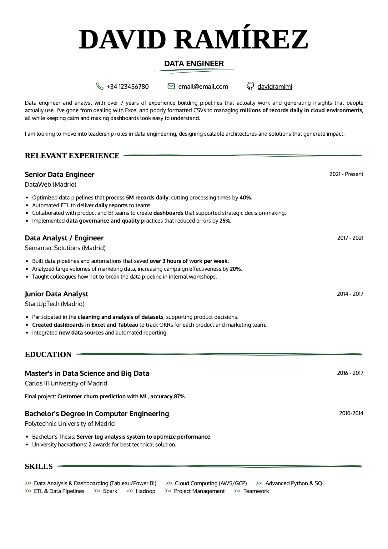 |
 |
 |
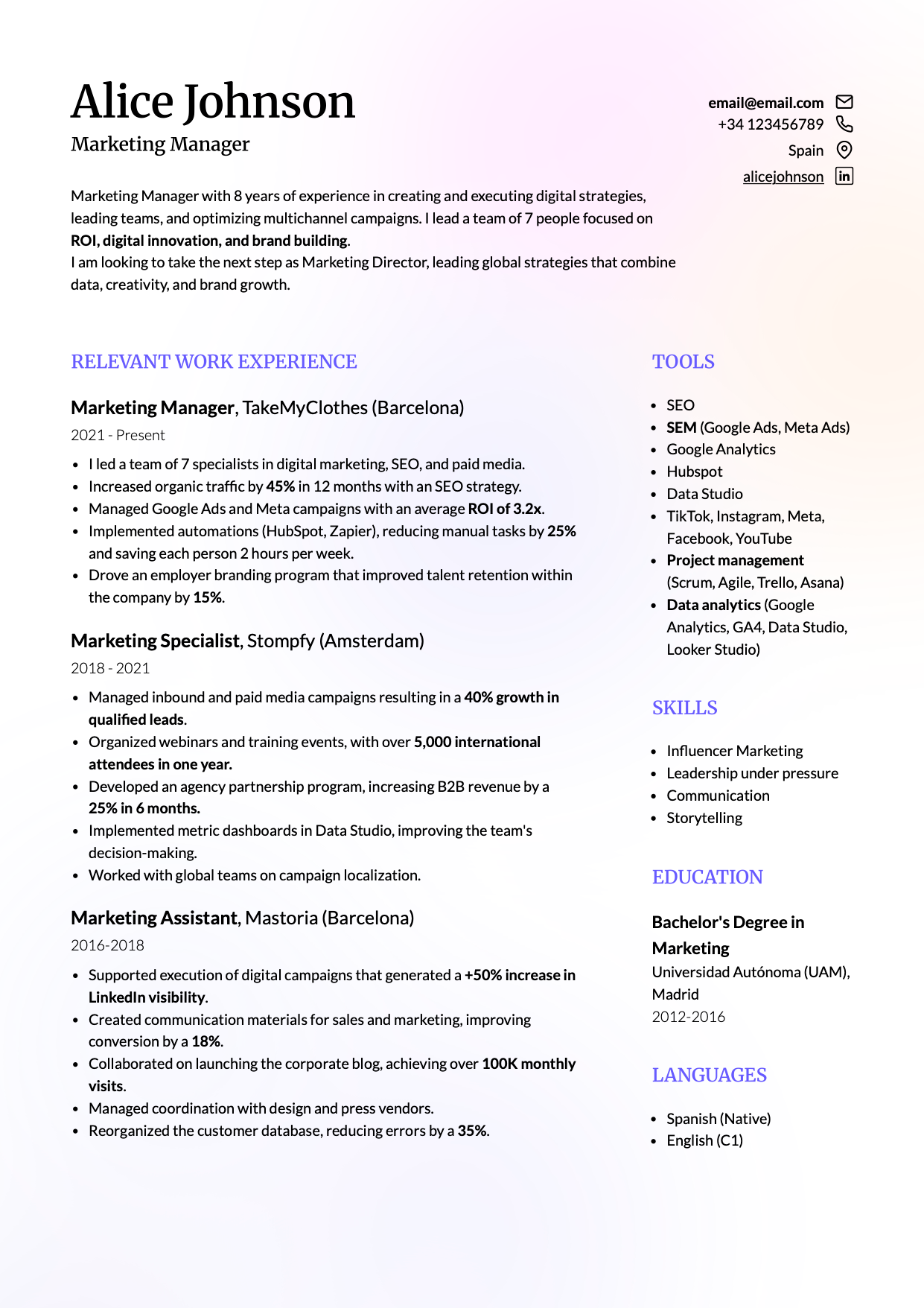 |
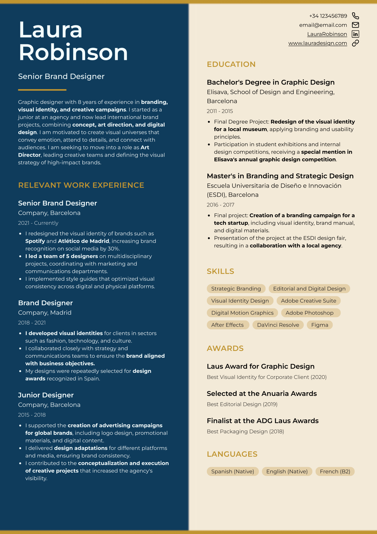
Customizable CandyCV templates: choose the format that fits your situation best, then tailor sections, colors, fonts, and more.
The resume format you choose must be ATS-friendly
Applicant tracking systems (ATS) inspire a lot of fear and honestly, the internet has earned that. There’s no shortage of “advice” claiming an ATS will reject your resume because of one tiny formatting choice. That’s a simplified (and outdated) view.
What ATS software needs is simple: it needs to extract your information reliably. So a smart resume format is versatile: readable for software, compelling for humans.
How to tell if your resume format is ATS-friendly
A good rule of thumb: if it’s easy for a human to skim, it’s usually easier for software to parse (clear headings, strong contrast, readable font sizes, and whitespace between sections).
Usually. Not always. The risky cases are when your layout depends on elements that don’t behave like real text (tables used for layout, text boxes, text embedded in images, etc.).
Resume layout best practices
- Pick a safe, readable font: avoid overly decorative or obscure fonts that may not render consistently across systems.
- Use bold with intent: emphasize section headers, company names, job titles, and measurable impact. This helps skimming.
- Use bullet points: dense paragraphs slow everything down. Bullet points should be concise and action-oriented.
- Stay consistent: spacing, font styles, and alignment should be uniform. Inconsistency creates visual noise.
Resume structures: choose the one that tells your story best
Your structure (reverse-chronological, functional, or combination) should match your career history. Choose the wrong one and you can confuse recruiters, blur your progression, or accidentally spotlight gaps.
Reverse-chronological resume format: the standard
Reverse-chronological is the most common format for a good reason. It starts with your most recent role (or education) and moves backward, making it obvious where you worked, what you did, and when.
- Best for: people with a clear, mostly linear path, applying to roles similar to what they’ve done recently.
- Why it works: recruiters expect it; many ATS systems handle it well; it shows progression clearly.
- Watch out for: gaps. The timeline is visible, but gaps don’t automatically disqualify you if you handle them calmly and clearly.
This structure is usually the safest option, especially if you’re not making a major pivot. The key is: don’t turn each role into a task list.
Functional resume format (and why it’s usually a bad idea)
A functional resume organizes your background by skills or areas of expertise, not by work history. It often starts with “Core competencies” or a “Summary of qualifications,” and downplays where or when you used those skills. Work history appears later, sometimes with minimal detail.
People use it to highlight transferable skills, major career changes, hide irrelevant roles, or mask gaps. The problem is: recruiters are often skeptical.
- If a recruiter can’t quickly understand your progression (or can’t see where you worked, what you did, and for how long) many will move on.
- It can also create friction for ATS parsing when dates and job entries aren’t clearly structured.
If you absolutely must use a functional format (or you’re in a niche process that asks for it), include dates and employers clearly. Transparency beats cleverness. Otherwise, a reverse-chronological resume with a strong summary and transferable impact bullets often works better than a functional resume, especially if you also write a strong cover letter.
Combination resume format (also known as hybrid resume format)
A combination (hybrid) resume blends a targeted summary/skills section with a traditional reverse-chronological work history.
- Great for: career changers, people with a broad skill set, or anyone whose strongest value isn’t obvious from job titles alone.
- Why it works: you control what the reader sees first, while still giving them the structure they expect.
- Mistake to avoid: redundancy. If your top section just repeats what your work experience already says, you’re wasting prime real estate.
Use the top section to spotlight high-impact outcomes, certifications, and role-relevant skills.
If you want to do this well, this guide helps you turn skills into readable signals: how to highlight and prove skills on a resume.
Example:
A software engineer moving into product management might open with highlights like “Led cross-functional initiatives,” “Owned product roadmap decisions,” or “Improved UX through data-driven iteration,” then follow with reverse-chronological engineering roles.
Layout decisions that make your resume easier to read
One-column vs. two-column resumes
You’ll still see advice that says “one column is safer.” That’s oversimplified.
Many modern systems can handle two-column layouts if the reading order is clear and you’re not relying on fragile layout tricks. Not every system parses it perfectly, though; so your goal is a two-column layout that behaves like text, not like a poster.
What matters:
- The text reads in a logical order.
- Sections are clearly separated.
- You avoid layout elements that confuse extraction.
What to always avoid (even if it looks “modern”)
- Skill bars (they don’t prove anything and often add noise).
- Icons replacing text. If you want to show proficiency, write it (“Advanced,” “Proficient”) instead of using stars.
- Text inside images.
- Tables used to lay out content, especially if you are making your resume in Word, can make the document harder to edit, maintain, and export correctly. Here we explain what mistakes to avoid when making a resume in Word.
If you built your resume in Canva, the core risk is that many templates are designed like graphics, not like structured text documents. Here’s why Canva resumes often fail (and what to use instead).
What font should you use on a resume?
Use a professional, readable font. Don’t try to “design” with typography.
For ATS-safe resume fonts recommendations: best resume fonts that are ATS-friendly.
The best file type for submitting your resume
The file type you upload (PDF, Word, or even a link) affects how your application is received, processed, and perceived.
PDF: the default standard and ATS-friendly
PDF is usually the best choice for resume submissions.
- Formatting stays stable: fonts, spacing, and layout are preserved across devices.
- Harder to edit: reduces the risk of accidental changes.
- Widely readable: no special software needed beyond a basic PDF viewer.
- Often ATS-compatible: as long as it’s a text-based PDF, many systems can parse it.
How to export your resume as a PDF (the right way)
- Use “Save as” or “Export to PDF.” Avoid “Print to PDF” if it turns your document into an image.
- Use common fonts or embed fonts to reduce rendering issues.
- Keep the file reasonably small (as a rule of thumb, aim for under ~1MB).
Word (.docx): only in specific cases
Sometimes recruiters or staffing agencies ask for a Word file so they can add notes, remove personal info, or reformat before sending it to a client. If you weren’t explicitly asked, PDF is usually safer.
Send a Word document only if you are explicitly asked to do so. In that case, the decision is not just whether to send a .docx or a PDF. The template you use, how the resume is laid out, and whether you can update it without breaking the format also matter. Here is a specific guide on how to make a resume in Word, what mistakes to avoid, and when to export it as PDF.
Risks of Word files
- Formatting breaks easily across Word versions and operating systems.
- Accidental edits are more likely because the document is fully editable.
- Security restrictions: some organizations block Word attachments due to macro-related risks.
If you do not need to submit a .docx file but still want a clean and familiar structure, a Word-style resume template can give you that document-like look without working directly in Word.
The Harvard resume template: a format that works
The Harvard resume format is a clean, typically one-page template designed for clarity, impact, and fast reading. It’s popular with students and professionals in structured fields like consulting, finance, and academia.
People often associate it with ATS success. The reality is: Harvard-style simplicity helps, but it’s not the only layout that can work. You can use more modern formats without fear if you respect ATS-friendly formatting rules.
It’s usually not the best fit for:
- Creative roles where visual differentiation is part of the evaluation.
- Environments where an overly academic template makes you blend in.
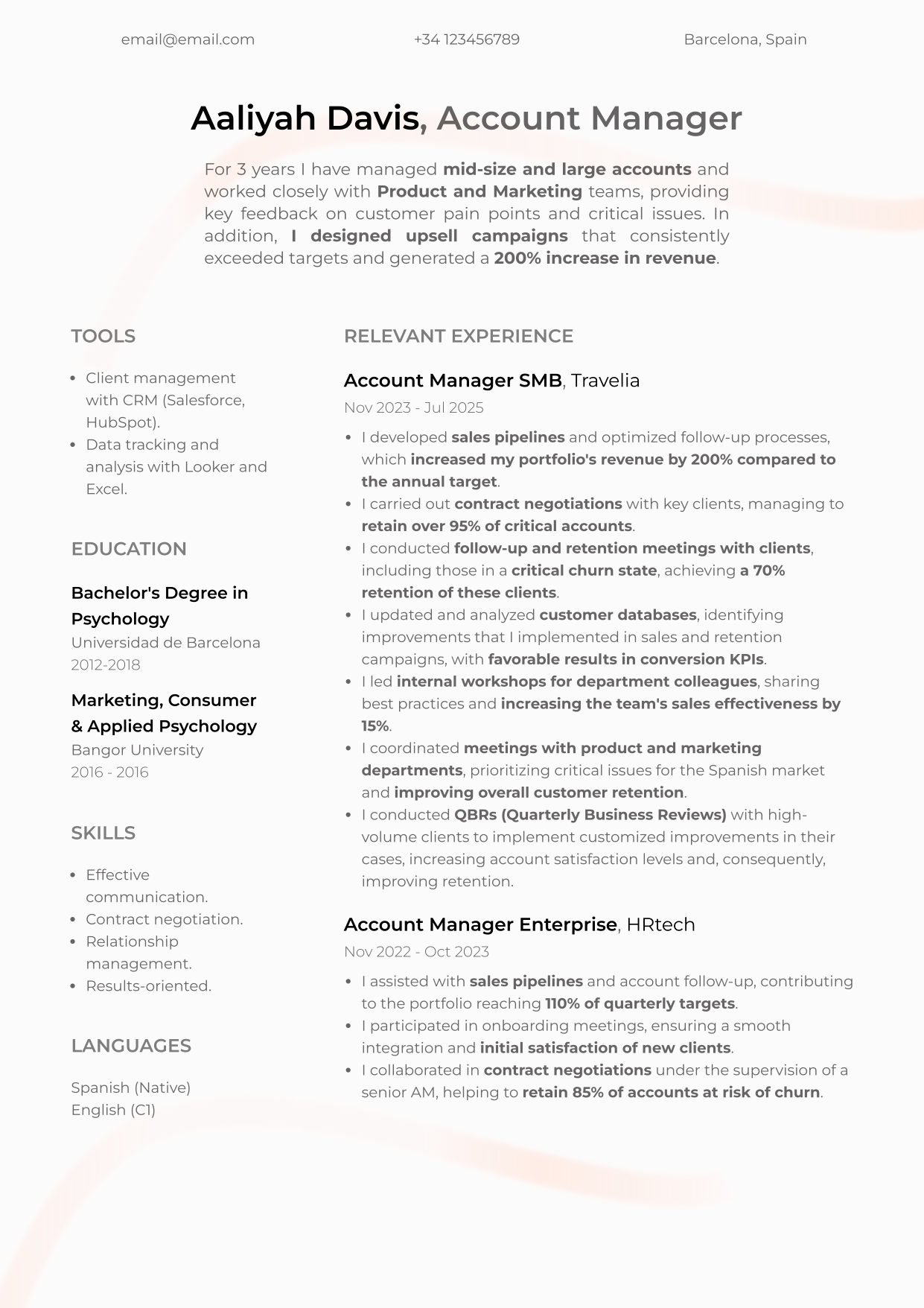
 |
 |
Adapt your resume format by industry, location, and career stage
A “universal” resume doesn’t exist. A marketer applying in Silicon Valley will often choose a clean, minimalist resume. But if that same person applies in a different market, expectations can shift.
Location rules that matter
Resume norms vary by country, shaped by culture and employment law.
- United States (and often the UK): avoid personal information like a photo, age, marital status, gender, religion, and similar details. In the US, adding a photo is generally a bad idea because it increases bias risk and can trigger employer discomfort. If you’re targeting US roles, don’t do it.
- Continental Europe: in some countries (including parts of Germany, France, Spain, Austria), photos may be more common. Still, “common” doesn’t mean “required,” and expectations vary by industry.
- Latin America: photos and more design-heavy resumes may be accepted more often, depending on the country and sector.
- Asia (Japan, South Korea): resumes can be more structured and may include personal details; norms differ significantly from US practice.
- Australia and Canada: often closer to US/UK norms (no photos, limited personal info), though details vary.
If you’re unsure, look at recent resumes from people in your target market and role on LinkedIn, ask local professionals, and check employer guidance. When applying in the US, default to reducing bias signals and maximizing job-relevant content.
Resume format by industry
Every industry has its own unwritten rules.
Tech (software engineering, data, IT)
- Clean, minimalist layouts with readable typography.
- Emphasize technical skills, tools, and project links (GitHub, portfolio, etc.).
- Prioritize impact: what improved because of your work.
Creative roles (design, marketing, UX, advertising)
- Your resume can reflect your personal brand, but it still needs to be scannable.
- Make your portfolio link impossible to miss.
- Focus on outcomes and storytelling: what makes your work effective and distinct?
Traditional sectors (finance, legal, academia, consulting)
- Keep it sober and clear. Minimal color, minimal visuals.
- Strong reverse-chronological structure and professional tone.
- Measurable outcomes matter.
Resume format by career stage
Your career stage changes what you should emphasize.
Early-career or limited experience
- Lead with potential: education, projects, internships, volunteering, relevant skills.
- You can use a more flexible structure if needed, but try to keep your resume to one page.
Mid-career
- Emphasize growth, leadership, project ownership, and clear impact.
- Reverse-chronological usually works best.
- Combination can work well if you’re pivoting roles or industries.
Senior leaders / executives
- Lead with strategic outcomes, scope, leadership, business impact, and sustained results.
- Two pages can be reasonable if it’s truly high-signal and well-edited.
- Start with a strong executive summary that frames your narrative.
Returning to work after a gap
- Address gaps with calm honesty.
- Highlight learning, upskilling, transferable strengths, and your return-to-market story.
- A combination format or reverse-chronological with brief clarifying notes can work well.
Conclusion
Searching for “the” perfect resume format can become a procrastination trap. The useful question is:
What structure shows my value best for this employer, in this industry, in this location, at this stage of my career?
Resumes that work are strategically structured, context-aware, and goal-driven. The best format evolves with you: it reflects your progression, matches your market, and makes it easy and fast to understand your impact.
If you protect clarity, ATS readability, and human narrative impact, and you choose the right file type, you’ll be in the small minority of resumes that actually get read.
Want a resume that does all of this?
At CandyCV, we help you build a resume that doesn’t just look good: it tells the right story, in the most effective format, for the role you want.
FAQs about resume formats
What is the best resume format?
For most applications: reverse-chronological structure, a simple one- or two-column layout that reads cleanly, and a text-based PDF. Adjust based on industry, career stage, and the submission channel.
Is PDF or Word better for a resume?
PDF is usually better because formatting stays stable. Use Word only when the employer or recruiter explicitly requests a .docx.
Reverse-chronological, functional, or combination resume format?
Reverse-chronological is the standard. Combination is useful when you need to control the first impression (career change, broad skill set). Functional should be a last resort and never at the cost of hiding dates.
One column or two columns?
Both are ATS-friendly resume formats, the decision depends on your role and industry. Either way, make sure your resume layout is clean, the reading order is obvious, and you avoid tables/text boxes/images for important text.
Can I build my resume in Canva?
It may look great, but most Canva templates behave like graphic design rather than structured text, which can break reading order and text extraction. If your goal is an effective, ATS-friendly resume, avoid general design tools. The best alternative is CandyCV.
Is the Harvard resume template good?
Yes for clarity and low friction, especially in traditional industries. For creative roles or when you need stronger visual differentiation, a modern layout may serve you better if it stays readable and ATS-safe.
Should I include a photo on my resume?
If you’re applying in the US: generally, no. It increases bias risk and can work against you. Norms vary by country, but for US roles, prioritize job-relevant content over personal details.